SmugMug Cart and XO Redesign
Client: SmugMug | Year: 2015-2017 | Role: Lead Designer, User Researcher
About the Company:
Smugmug is a photo sharing and hosting platform that allows users to upload and then sell their images online in the form of physical prints, gifts and also digital downloads.
The Problem:
Year over year, the print business was declining. Not only with SmugMug but industry wide. People are focusing more on digital downloads to preserve their memories. How do we reverse that trend and keep our business afloat?
The Challenge:
Reverse the trend of declining print and gift sales. We thought to create a new mobile friendly UX + UI to increase both mobile and desktop checkout rates.
My Role:
I was the sole designer on this project that ran weekly status meetings, interacted with engineers, and product managers, while also running internal user testing and prototype demonstrations.
Process:
Research: Starting with our current site and benchmarking others.
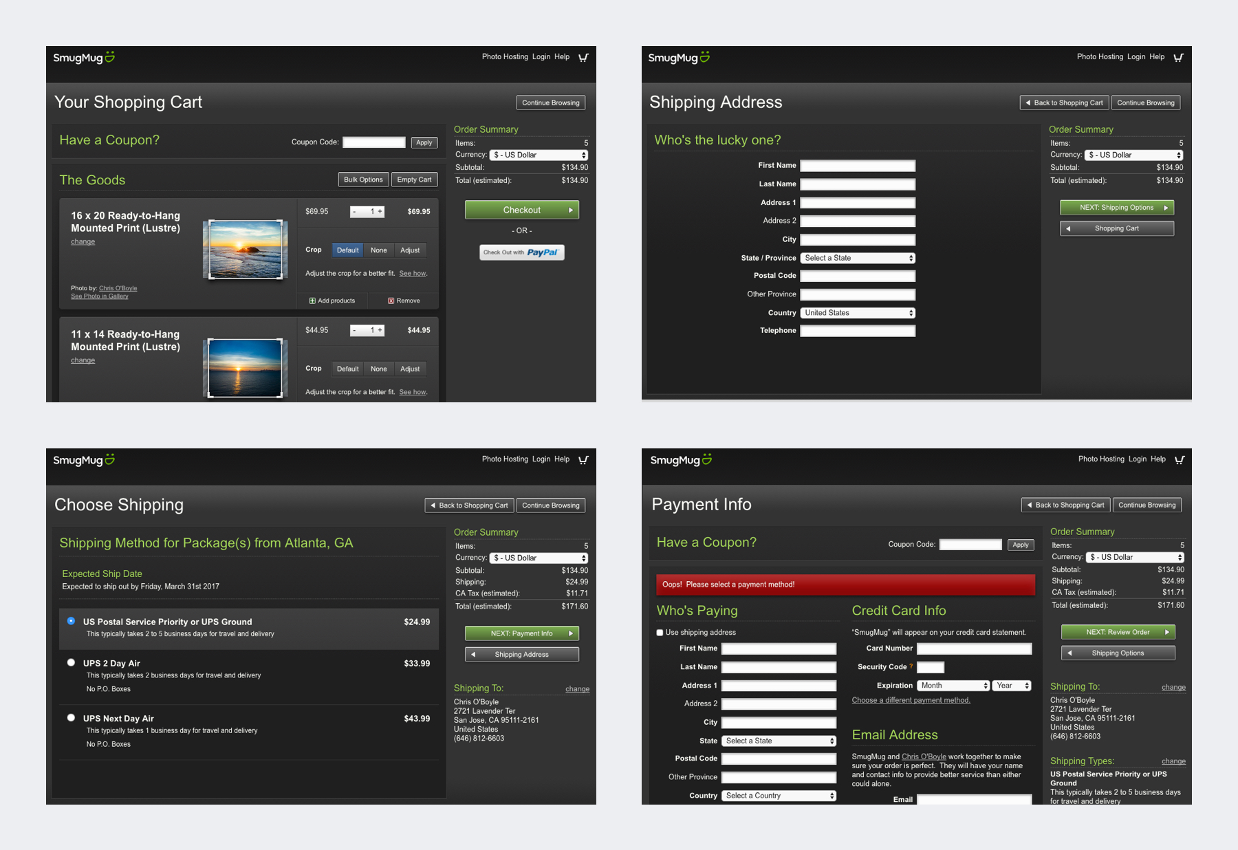
Let’s start with the old screens. The original flow was designed by a an old family friend that was primarily a developer, and while it had all of the necessary components, it didn’t give a lot of consideration for user experience. Some things were a little clunky and hard to use, some features were hard to find or took you out of the checkout flow completely. And most importantly, this wasn’t mobile friendly at all.
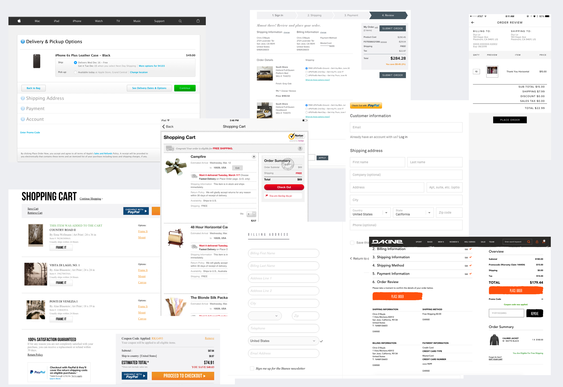
Other websites both desktop / mobile:
Brainstorming / Wireframing: I set off to begin my wireframes and design iterations. Although I don’t have any photos of sketches or whiteboard sessions, I do have some low fidelity examples. This is one of the early iterations, I went for a similar side bar style. Although some shopping carts have the summary section near the bottom, this didn’t seem viable for us because users could potentially have hundreds of items and I wanted the summary to always be visible, even when there are lot’s of products in the cart. In addition I started with a mobile version alongside. Even though the majority of our visitors are from desktop or large screens, we see the mobile traffic increasing YoY.
Test / Get Feedback: Here you can see, a very rough draft of what I was invisioning. Some of the ideas I had here weren’t completely viable and after user testing internally and getting feedback, I decided to change some things. One thing that I wanted to change was, instead of showing the crop mask and the full photo with the cropped area, I wanted more of a WYSIWYG display, that shows only the “cropped” image. So no more black bars over the image. The reason for this was because every day we have multiple tickets on the help desk that are complaints by a customer stating that they got their print, but someone’s face is cut off or someone is missing from the print. Most of these cases were due to cropping errors made by the user. Of course we help them fix it and replace their order at no charge, but that comes out of our pocket, so we want to reduce these errors. Some user’s complaints were that they were confused as to what these black overlaid bars meant. If they could still see some of the image behind it, they thought it would be in the print as well.
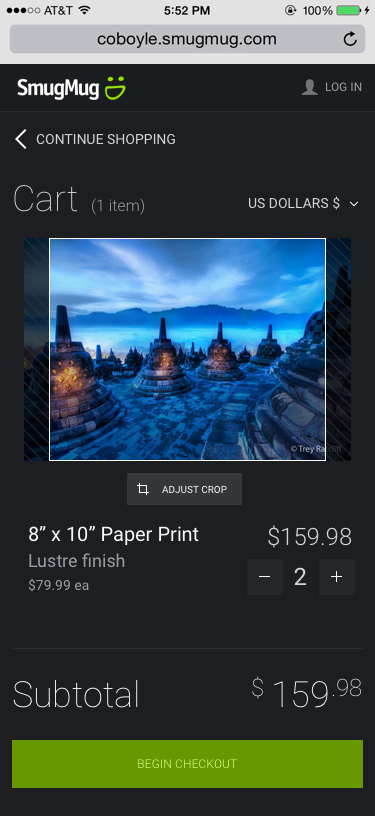
Iterate: After multiple months, and meetings. More features, buttons, products, etc, were added, so my simple UI wasn’t able to be so simple anymore. There was much more feedback, such as the desire to have a dedicated “remove” button on mobile. I tried to save space by coming up with a simple way of displaying a Trash can icon once a user changed the quantity to zero, but it was thought to be too hidden and not obvious enough. Also, due to limited space, I had to get fancy with the button text. I couldn’t have an “Add Extras” and “Edit Extras” label, so I depended on the icon to do that work for me. I also added a sticky “Checkout” button to the header with a simplified “Subtotal” view so that a user can quickly move on to the next (Review) step. Of course one of the most obvious changes on mobile was the reduction in image size. This came from the feedback that we sometimes have VERY large carts, with hundreds of images, and to save on vertical real estate I did a multiple column (instead of rows) layout.
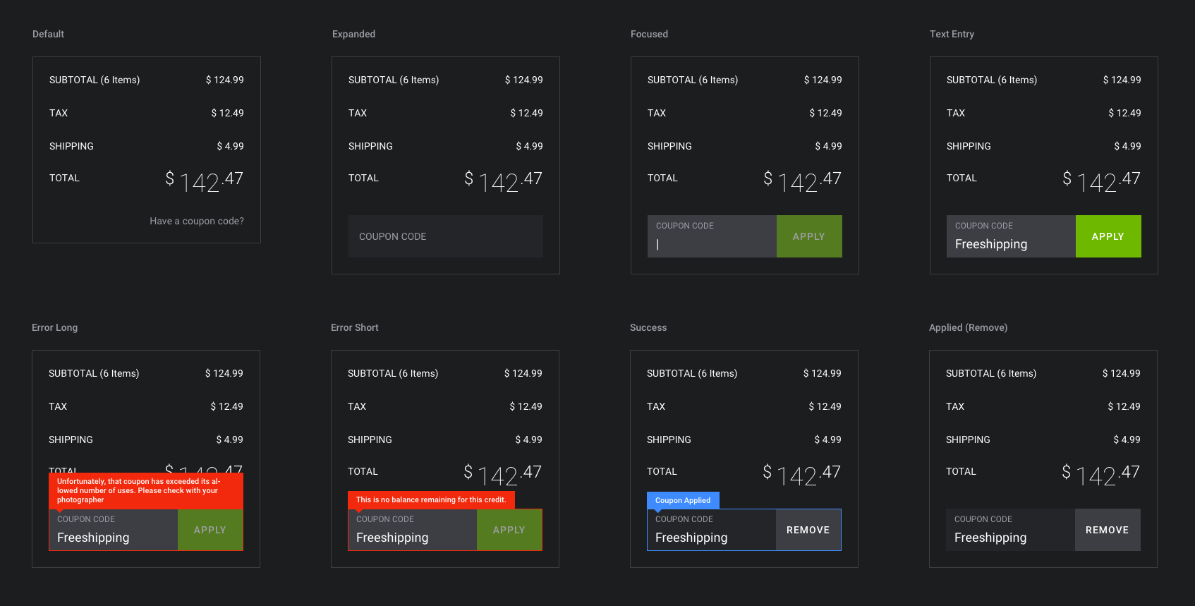
There was plenty of other work to be done though, all of the little nuances, and small interactions, how do you change the currency? What does the dropdown look like? How does the Remove work? Is there a confirmation dialog? Well I won’t get into all of those designs, but here is an example of a complete flow and different states for something like adding a coupon.
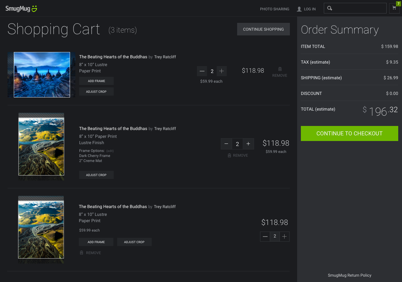
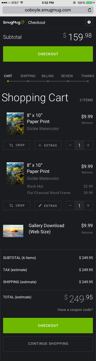
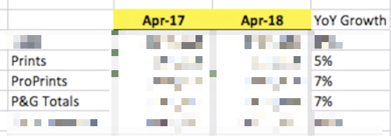
Ship It: Finally I shipped the following designs as final. And what a difference it’s made. We went from a declining physical prints business, to a positive growth! Measurable Success!
Shopping Cart Screen

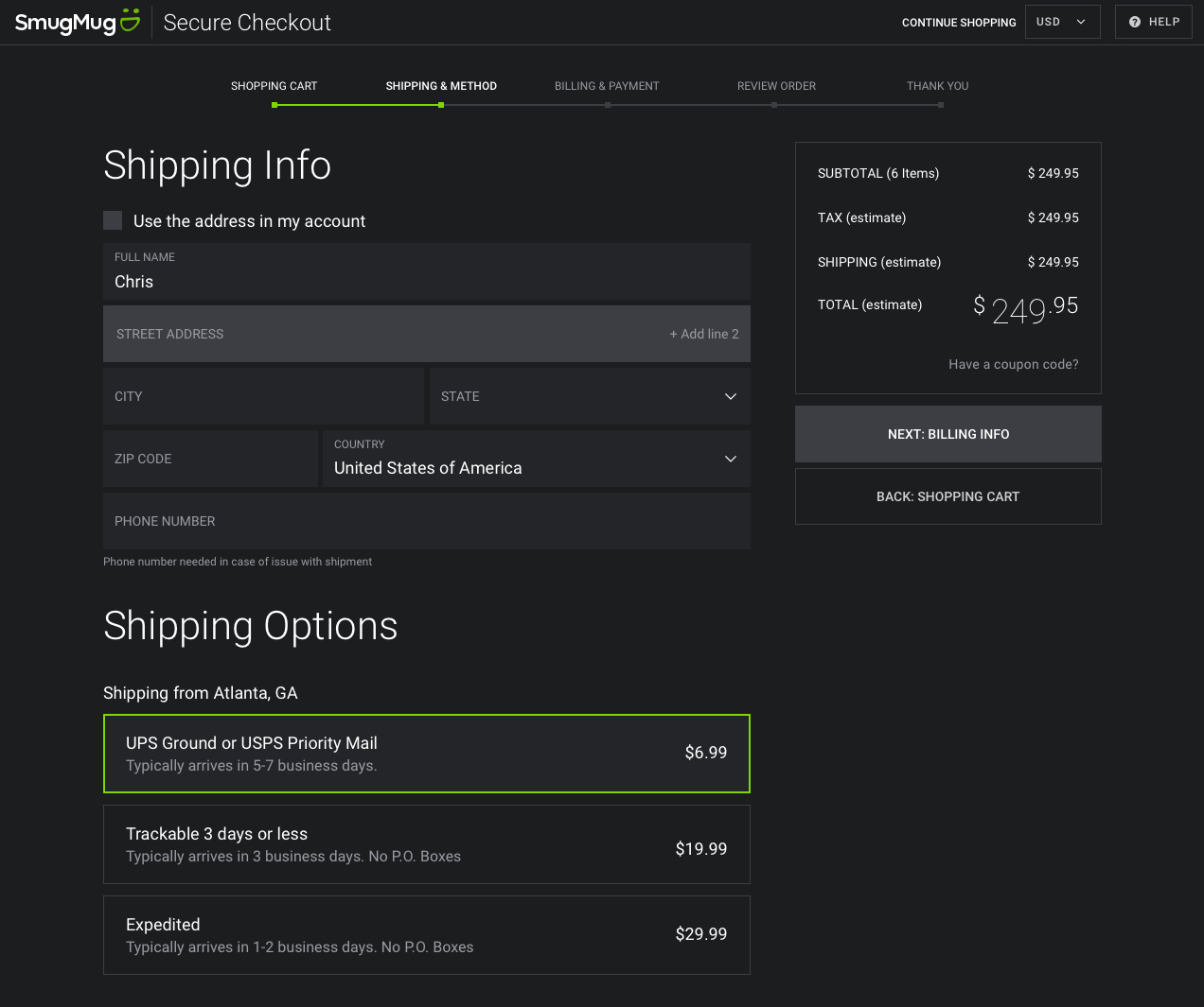
Shipping Info / Options Screen
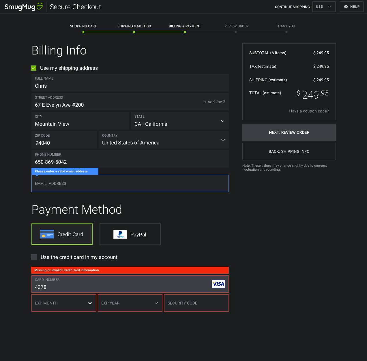
Billing Info / Payment Method Screen
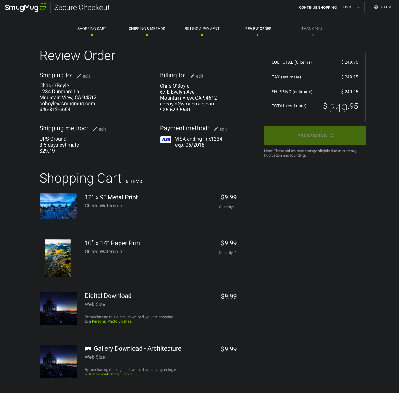
Review Order Screen
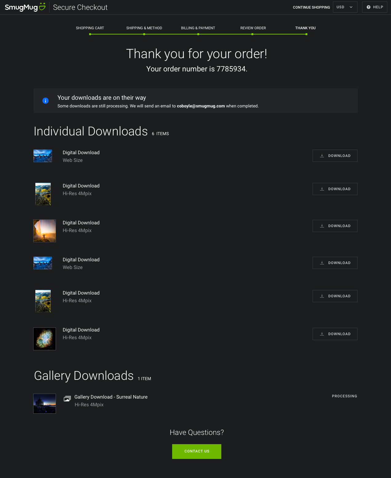
Thank you / Confirmation Screen
Responsive Examples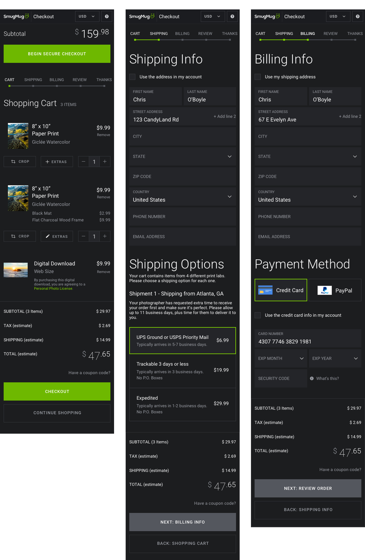
Once you ship however, it’s not over. We are always collecting feedback, and even after finishing up one project and starting another, the previous project may have some implications on the new one. An example of this, is being able to order frames and finishes from the cart screen. This created the need for a new design to order these. However, not only must you design that new experience, but how do we connect them? How do you access it from the cart? What does the link/button/text say? Well, I took a stab at it with an “Add Extras” button, but we wanted to A/B test the words on it and found that “Finishing Options” performed higher. So that is what we are going to change it to moving forward.