Yahoo.com stream personalization
Client: Yahoo | Year: 2019-2020 | Role: Lead Designer, User Research
Problems, challenges, and my role
Problems:
- Yahoo’s viewership, DAU’s and LIDAU’s were steadily declining
- Competitors were more modernized
- Lack of personalization features.
- User had little control over what was shown.
Challenges:
- Create an experience where a user could give explicit signals to personalize what is shown in their stream.
- Develop a phased approach
- Main goal: improve user retention
My role:
In addition to being the sole designer, I ran weekly status meetings, interacted with engineers, product managers, and ran user testing sessions alongside our user researchers. I also developed prototypes and demoed them to our stakeholders including our CEO.
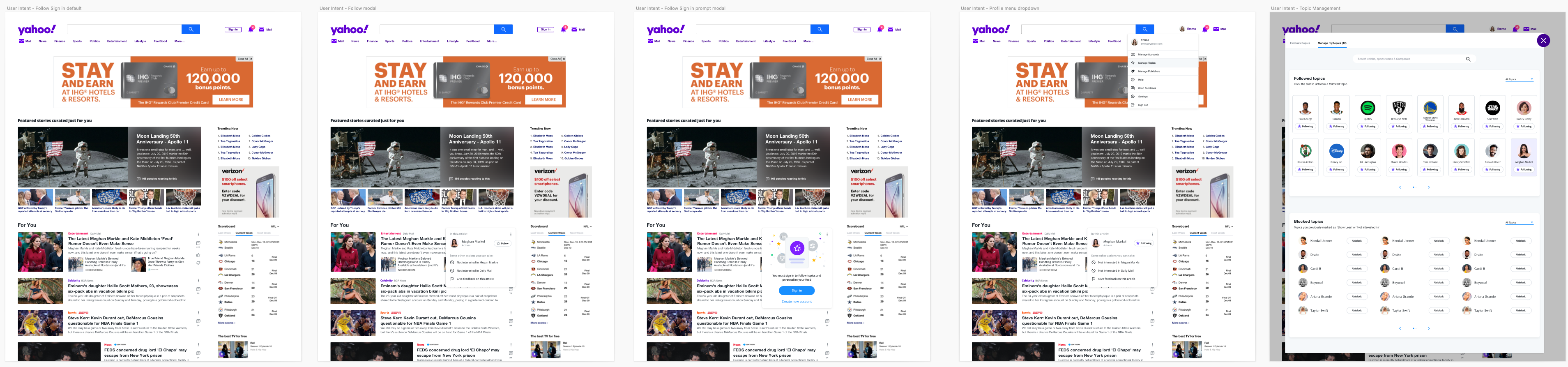
Strategy, kickoff and research
To improve our understanding of our users and their interests, we will be asking them to provide us with overall feedback about content in the stream. This feedback will be a general/broad-spectrum on the entire content piece and allow us to reinforce our inferred signals to understand the user better. From a user standpoint, this feature will function as a Show More / Fewer tool. The feedback will Not be editable or exposed via any feedback management tools. The user will not be required to sign in to start with but will be requested to do so and will have an artificial limit post which it will be required.
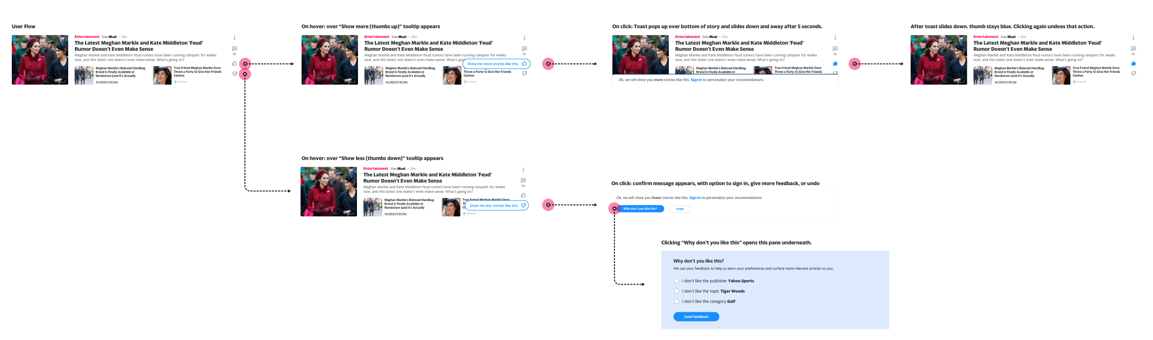
User journey development
I created a simple user journey flow to show proof of concept of how the icons may look, location, and actions a user can take. Straight forward with only two main actions, show more and show less. With Show more, we invite them to log in to save their preference, and with show less we ask for additional feedback.
Prototyping and user testing
Click here to view the prototype
Key findings:
- P2 felt it was difficult to respond with a Thumbs Up or Down without reading the article and was concerned it would contribute to people reading fewer articles.
- Most participants (P1, P3, P4, P5) thought that they would respond based on whether they liked the article. Others (P2) thought they would respond whether they would recommend the article.
- All participants understood they would see more basketball, ESPN, or sports stories if they clicked Thumbs Up
- 4 participants saw that the message changed from “Show me more stories like this” to “Great, we will show you more stories like this” when they clicked Thumbs Up. (P4 clicked too quickly to see.)
- Participants weren’t sure at what level these settings were. Overall, all participants thought they should manage content at the Topic level
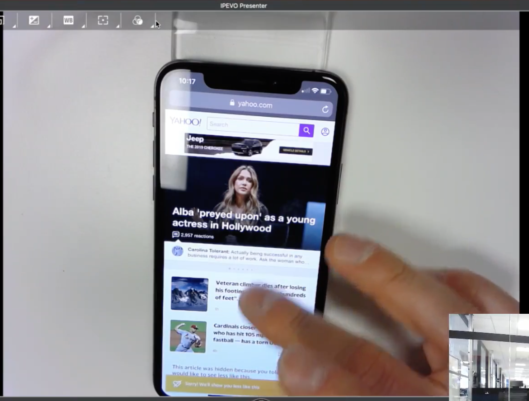
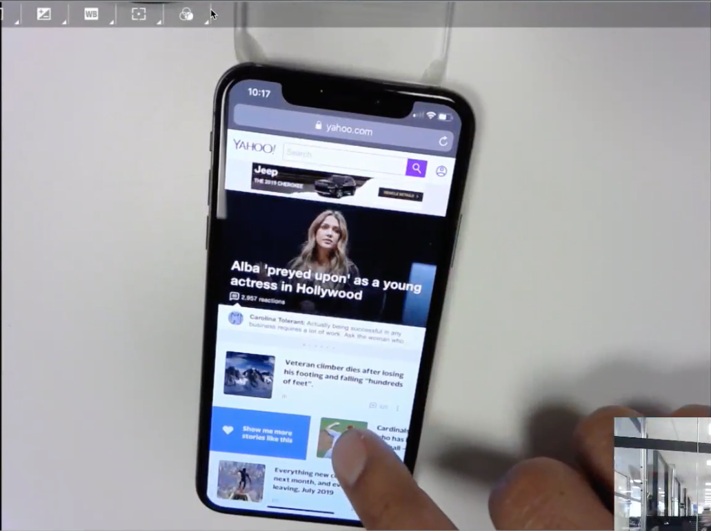
Mobile web explorations
For mWeb, I wanted to have a very similar experience, but instead of traditional icons, I wanted to try to use native gestures to simplify the process for users. This included challenges for discoverability, but I remedied those by adding hint animations to educate the user.
Click here to view the prototype
Key insights:
- P1 and P4 were able to discover Show More/Less when prompted to manage their feed. Other participants guessed it would be in settings, profile, or under the ellipses (in two-sided Swipe)
- Between the one-sided Swipe and two-Sided Swipe, all participants preferred the one-sided swipe. They were mainly worried about errors and felt it was easier to understand.
- All participants understood Show More/Less would increase/decrease the amount of similar content in their feed. Some participants thought it would be instantaneous with articles being added/removed immediately, while others thought they would need to refresh the page. Most participants thought it would manage content at a topic or category level, like sports, entertainment, baseball, or Cardinals.
- Participants expected a wide variety of options under the Ellipses/More Options button including hiding articles, saving/sharing/downloading articles, and refining the Show More/Less setting to a specific topic or category.
- A few participants misread “Hide posts from Yahoo Lifestyle” as “Hide post from Yahoo Lifestyle” and thought it would hide the article with no other effects. Participants also misunderstood Yahoo Lifestyle as managing the category of Lifestyle and not the publisher Yahoo Lifestyle.
- All participants felt positively towards the language used. P2 and P3 thought it could be more specific. P5 felt the color was not intuitive.
- Participants were asked how they felt about the heart and crossed heart icons and whether they would prefer a thumbs up and down. Overall, participants did not have strong opinions about the icons used.
Learnings and results
What did we learn?
- Mobile gestures didn’t feel native
- UI was seen as crowded
- Users had trouble understanding why they should personalize or how it made an impact
- How did users know their feedback mattered?
- We could do a better job of educating the user, better value props.
- Maybe we could gamify it?
- Maybe we could gamify it?
Changes made:
- Cleaned up desktop UI, showed icon on hover only
- Mobile gestures were changed to be more in line with a recent native change (iOS)
- Stream was changed to show more immediate feedback when action was performed (hiding that story for example)
Result metrics (QoQ):
- 7 day retention went from 2.4 -> 4.6
- Slowed our ad-revenue decline
- Interactions per user per session 6.3 (well above target of 3)
Visual design and deliverables
